Hollywood Films

Machete Kills
Genre :Action | Crime | Thriller
Machete kills is a very successful film and the poster twat was created for the movie helps to portray this. Firstly the layout of this particular poster is very interesting as it links to tag line at the bottom saying ‘watch it or die’. This is linked because of the knife with blood on which is in the middle of the poster which has the connotations of death. Not only this but the poster gets the audience to think about who is the woman on top of the knife, is she a hero or a villain? Taking over the poster is the title which seems to be created with the use of blood along with the knife which is right in the middle of this poster which is also covered in blood. As the knife is taking over the poster we as the audience assume that the film is probably an action film or horror. I think this because no other film posters would have blood on most of the poster unless it had something to do with death but we assume this film would be an action movie because of the girl with the shooting gun that is sitting on top of the knife. This might indicate that there could be a wish of revenge or murder in the film. The colours that are used are red; grey and white out of which red stands out the most as it is the most potent colour. This can connotation a lot of things and also reveal some information about the film and its plot. The colour red reveals that there could be death, love and danger in the film. I believe that the film will probably be related to death because of the gun and the knife on the poster. Other than red the two other colours grey and white do not reveal much about the film as they are simple colours that do no connote a lot.
On the poster there are two main images used. The main image being a female which is on her own but possessing a weapon which I believe to be the hero or the villain. The female is not taking much space on the poster and the title had already done that. The second main image is a knife with blood on the end of it which suggest someone could have been stabbed with it and that it has already been used.
The font and the lettering of the title and tag line are big and bold to stand out, this is usual with an action or horror film posters also the two are both in the colour red foreshadowing that they are linked.
At last in the i think that this poster is portrayed the representation of women in a negative way because the main image of the female on her own but holding a dangerous weapon which she is already using. This foreshadows danger which also links to the main colour in the poster, red. This suggests that the women in the film are most likely going to be dangerous.

Hansel and Gretel:Witch Hunters
Genre: Action | Fantasy | Horror
-From this particular Film Poster I can see that the role of the woman in this film is definitely the lead character or one of the two main as she dominates the poster with a man standing behind her,The supporting image on this poster is the background which is mountains covered in snow showing where the movie is probably going to be set.As the woman is front of the man she is shown as strong and fearless also she seems violent as she has a dangerous weapon in her hand and shes ready to attack at any moment.As the woman has one of the lead roles i believe that in this poster females are represented as dominant characters, the sort of character which the whole story is based on therefore this poster represents women as extremely important.
I believe that this film is aimed both at the male and female audiences as it is a Fantasy film which women enjoy and also an Action film but in my opinion i think that this particular film would attract the male side more as the film is also horror and most women are frightened of things that are related to horror.

The Hunger Games ; Catching Fire
Genre: Action | Adventure | Sci-Fi
In this poster I can see that the role of the woman in this film is definitely the lead character as she dominates the poster,The image of her holding her bow and arrow whilst she is surrounded by fire is the main image on the poster, not only but this is the only image as the rest of the poster i plain black. As only the woman is on the poster i think that she is definitely the lead character The woman is shown as strong and independent because she is alone and she has a weapon in her hand pointing it towards the audience to show that she can look after herself and that she is prepared for anything In this poster women are represented as dominant characters, the sort of character which the whole story is based on therefore this poster represents women as extremely important and brave as they are depending on nobody else but themselves.
I believe that this film is aimed both at the male and female audiences as it is a sci-fi which and also an Action film which both female and male audiences because ths poster looks good and appealing to both genders.
Own Hollywood Hybrid; Chyna Doll/Survivor

My Draft Poster for Hollywood Hybrid of Action and Fantasy.
|
Final Poster Idea

|
Original Images

|
|
Survivor Poster

Film Noir Evaluation
This text would be produced by a few film institutions such as :Universal, Warner Brothers because they are two big companies who have produced most of the film noir posters and films . The target audience for this text would be both males and females of ages 15 and above up to people of the age of 30. The reason to why this product is targeted at this particular audience is because Dark Fantasy has a complex narrative which could be quite hard to understand for people under the age of 15, also because it is a black and white movie a lot of people under that age wouldn't be interested in such a product.
Before creating this product I have done a lot of research as I have watched and analysed Double Indemnity which is a classical film noir. I have also watched a Noir documentary to help me have an insight in how film noir is created and for what reasons also to help me understand how to create certain elements of noir and lastly I have also watched and analysed 3 opening film noir scenes.From this genre i found out that there are 3 main types of characters in the film, those would be a femme fatale, a doomed hero and an antagonist. Also what i have learned is that film noir was inspired by 'Hard Boiled' crime stories, not only but the whole film is narrated by the main character who is telling the story from their point of view. Also i have learned that film noir has a specific visual style as it is the only sub genre that has a mono crome visual style and that has a lo of light and shadow to create a sinister effect.
In my/this products codes and conventions have been used to communicate a particular representation.As this genre has a bad representation of women because they are the vicious characters in the film and the ones who are the most manipulative.This had influenced my poster as I made it look in a way that the female does look manipulative and vicious at the same time. Firstly the product has to represent women as evil, seductive and deadly. For this to be happening I have made the woman on the poster look manipulative as she is looking directly at the camera and smoking which shows how she have the power of getting people to look at her. Also cigarettes and smoking have connotations of death which shows that she is deadly.
Throughout this process I have made a few different designs and I had to pick which design I was going to use as my final one and this was very hard because I thought I had some really good posters done but I wasn't sure of which one to pick and to do that I had to ask some people to help me and to say which design they thought was more realistic and suited my film opening more, this had helped me a lot as I had managed to pick a final design.
In my opinion there are a few strengths but also a few weaknesses within my final production as I think I should have made the poster even more realistic by making all of the characters to have a comic like look because this would make the film more interesting and the poster much more noirish. I think I have positioned my characters well on the poster as you can see that femme fatale is dominating and that the antagonist and protagonist are both much smaller compared to her which is typical to film noir. Another strength that I have is that I have managed to create smoke coming out of the cigarette that femme fatale has in the hand. My weaknesses were in my opinion the fact that the poster wasn't dark enough and it didn't have enough shadow and boldness. Overall I think that my product was well designed and suitable for the noir sub genre.
Hollywood Hybrid Evaluation
This text would be produced by a few film institutions such as :Universal, Warner Brothers because they are two big companies who have produced most of the Action Horror posters and films . The target audience for this text would be both males and females of ages 15 and above. The reason to why my product is targeted at this particular audience is because Survivor has a narrative full of suspense and it may be found uncomfortable of people from an under age because the product is based on a true story.
Before creating this product I have done a lot of research as I have watched and analysed The Pirates Of The Caribbean- The Curse Of The Black Pearl which is a well known action adventure and horror film. I have looked into depth at the movie and analysed the scene in depth. This has helped me to understand reasons to why the action films are the way they are. The reason for this is because Action/Horror hybrids are seen and created in a certain way in Hollywood. From this hybrid i have learned that men are usually the dominating characters and the narrative usually develops around the male character, and that it is very unusual for a female to be a leader and that it the reason to why i chose to be different and go against the Hollywood stereotype.
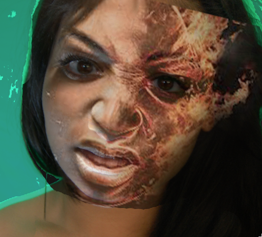
In my/this products codes and conventions have been used to communicate a particular representation.As this genre has a bad representation of women because they are the usually in need of help or the leaders of the quest which is very rare.This had influenced my poster as I made it look in a way that the female looks like a leader because she dominates the poster and this also shows that the whole story is based on her. Firstly the product has to represent women as frightening, strong and independent.For this to be happening I have made the woman on the poster look like she is a hunter because she had just survived a crash and even though now she look a like a monster it's due to the fact that she is in the wild alone and she had to adapt she now hunts not only animals but also humans, so people should want to survive an sonly the strong will survive against her.
Throughout this process I have made a few different designs and I had changed my idea of the actual poster, but now I regret doing so because I realise that I could have done a much better product on Chyna Doll.
In my opinion there are a few strengths but also a few weaknesses within my final production as I think I should have made the poster even more realistic by making the girl look more like a scary character. I honestly think I have done just ok but I think I could have done much better. Overall I think that my product was designed alright and suitable for the action/ horror hybrid.
Before creating this product I have done a lot of research as I have watched and analysed The Pirates Of The Caribbean- The Curse Of The Black Pearl which is a well known action adventure and horror film. I have looked into depth at the movie and analysed the scene in depth. This has helped me to understand reasons to why the action films are the way they are. The reason for this is because Action/Horror hybrids are seen and created in a certain way in Hollywood. From this hybrid i have learned that men are usually the dominating characters and the narrative usually develops around the male character, and that it is very unusual for a female to be a leader and that it the reason to why i chose to be different and go against the Hollywood stereotype.
In my/this products codes and conventions have been used to communicate a particular representation.As this genre has a bad representation of women because they are the usually in need of help or the leaders of the quest which is very rare.This had influenced my poster as I made it look in a way that the female looks like a leader because she dominates the poster and this also shows that the whole story is based on her. Firstly the product has to represent women as frightening, strong and independent.For this to be happening I have made the woman on the poster look like she is a hunter because she had just survived a crash and even though now she look a like a monster it's due to the fact that she is in the wild alone and she had to adapt she now hunts not only animals but also humans, so people should want to survive an sonly the strong will survive against her.
Throughout this process I have made a few different designs and I had changed my idea of the actual poster, but now I regret doing so because I realise that I could have done a much better product on Chyna Doll.
In my opinion there are a few strengths but also a few weaknesses within my final production as I think I should have made the poster even more realistic by making the girl look more like a scary character. I honestly think I have done just ok but I think I could have done much better. Overall I think that my product was designed alright and suitable for the action/ horror hybrid.
